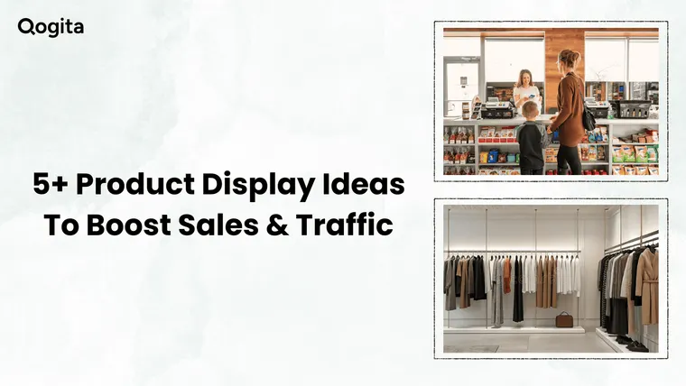
Walk into the right store and something just pulls you in. You slow down, pick things up, and somehow leave with more than you planned.
That's not an accident. That's a well-built product display doing its job.
Most retailers spend months finding the perfect products and barely any time thinking about how to show them. But research shows that 8 out of 10 shoppers make buying decisions based on what they see in-store. Your displays are either selling for you or quietly losing you customers.
This guide goes beyond the basics of product display ideas. You'll learn where to place displays, how to zone your store, which display types actually work, and how to build each one correctly.
Good products deserve good displays. Let's make sure yours are earning their place.
How Customers Actually Move Through Your Store
Product placement without understanding customer movement is just guesswork. And the thing with guesswork is that it works only about 1 in 4 times. So to make it work every time, you need to learn how your customers move through your store:
The decompression zone: why your entrance is probably wasted
The first 5 to 15 feet inside your store entrance is called the decompression zone. Retail behaviorist Paco Underhill first identified this in his book Why We Buy, after years of tracking shoppers through video cameras and direct observation. When customers walk in, their brains are adjusting to new lighting, temperature, and surroundings. They are not shopping yet.
Underhill described it directly: "By the time the person is starting to engage with the physical environment, some of the stuff you've put by the door is blown past."
So if you place your best new arrivals or a sale display right at the entrance, most shoppers walk past it without noticing. This does not mean the entrance is useless. You can use it to communicate your store's identity through clean visuals and clear branding. Save your high-margin and high-priority products for just past this zone, where customers are fully present.
The right-turn bias: where to put your best display
After entering a store, about 90% of shoppers naturally drift to the right and move counterclockwise through the space. Underhill called this the "invariant right," and it has been documented consistently across retail environments.
The wall or display area to the right of your entrance, just past the decompression zone, is where shoppers first truly engage. Is that spot in your store working hard enough? If it holds clearance bins or overflow stock, you are handing away your most valuable real estate.
Place your seasonal story, your highest-margin category, or your strongest visual display in that right-side zone. That is where attention is highest.
How traffic flow affects how long people stay
Customers who move through a store comfortably stay longer, and those who hit cramped aisles or cluttered pathways leave sooner. Walk your store during open hours and watch where shoppers naturally slow down and where they speed up or turn back. The spots where people slow down are your best display stand locations. The spots where they rush through are telling you something is wrong.
Does your current layout pull customers toward the back of the store, or do most people hover near the front and leave? Retailers who use display placement to draw shoppers deeper into the store consistently see longer visit times, and longer visits lead to more purchases.
A quick check you can do today.
Walk into your store as a customer would. Let yourself adjust for a few seconds, then notice where your eye goes. Turn right. Follow the natural path. Ask yourself whether the right things are in the right spots. You may find that a few simple moves, without any new fixtures or investment, can immediately change how well your space performs.
How to Zone Your Store Like a Pro
Every square foot of your store has a different value. Treating all of them the same is one of the most costly mistakes independent retailers make.
Think of your store in three zones. Each one attracts a different type of shopper attention and calls for a completely different display strategy.
Zone 1: The Entrance (First 5 to 15 Feet)
This is where customers are still adjusting to your store, not actively shopping yet. Use this space to set the mood through clean visuals and strong branding. Whatever you place here, repeat it further inside the store, because most shoppers walk through this area without fully registering what's in it.
Zone 2: Mid-Store (Your Real Selling Space)
This is where the shoppers slow down, browse, and make buying decisions. Your highest-margin items, bestsellers, and story-driven displays all belong here.
Height matters a lot in this zone. Research using in-store eye-tracking technology, published in the Journal of Marketing Research, found that shoppers are most likely to buy products that are placed just below eye level, around 14.7 inches below eye height.
A UK coffee manufacturer who tested shelf positioning with data science found that products on the optimal eye-level shelf had 23% greater sales potential, while items on the shelf just below suffered a 25% sales drop. The principle is simple: eye level is buy level.
Endcaps in the mid-store zone are another opportunity most independent retailers underuse. Research published in the Journal of Retailing and Consumer Services found that endcap placement increased product sales by 346% for front-endcaps and 416% for rear-endcaps, compared to the same products sitting on a regular shelf.
Zone 3: The Checkout Counter
Customers here are mentally done shopping. They are wrapping up, not browsing.
This zone works for:
- Small, low-cost, grab-and-go items
- Products that need zero explanation
- Impulse additions to what they already bought
It does not work for high-ticket items, complex products, or anything requiring a decision. Save those for mid-store.
Quick Audit to Do This Week
Sketch a rough floor plan of your store and label the three zones. Then look honestly at what currently sits in each one and ask yourself whether it matches how a customer thinks and feels at that exact spot. Most retailers who do this find at least two or three products sitting in completely the wrong zone, and moving them costs nothing.
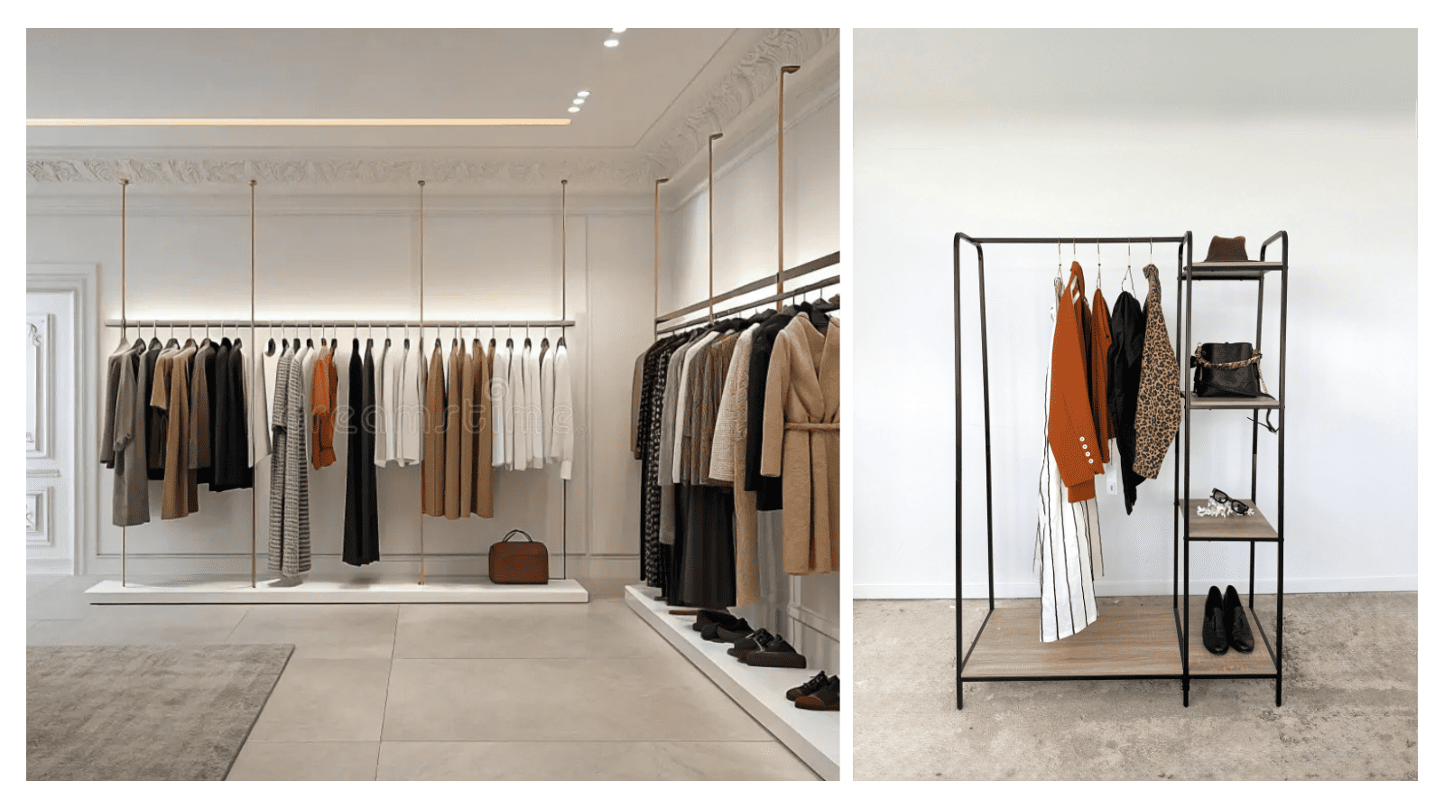
8 Creative Product Display Ideas by Display Type
Knowing where to place displays is half the battle. The other half is knowing how to build them. Here is what actually works, broken down by each display type you have in your store.
Window Displays
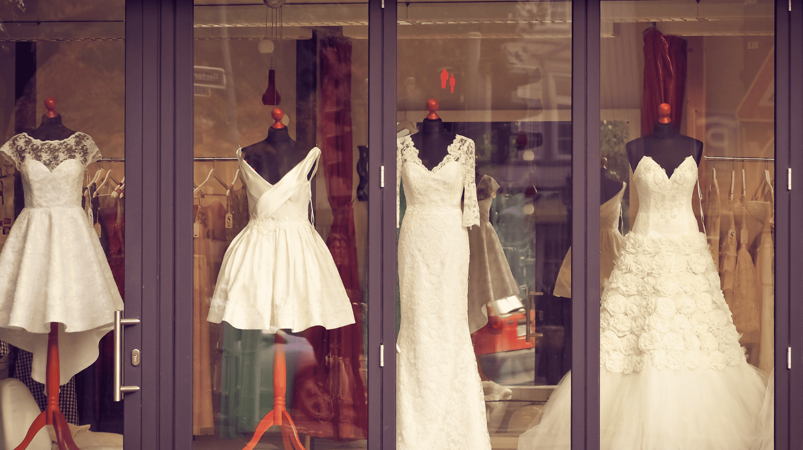
Your window is a 24/7 salesperson, but only if it is telling a clear story. A window trying to show everything ends up communicating nothing. The most effective windows tell one focused story that a passerby can understand within ten seconds of walking past.
To get there, here’s exactly what you need to do:
- Lead with one clear theme. A courtside collection for tennis season, a cosy gifting scene for winter, a morning routine for spring. The theme gives context to every product and makes the display stand feel intentional rather than assembled.
- Use the pyramid principle. Place your tallest or largest item at the centre and let smaller products step down on either side. This creates natural eye movement and stops the display from looking flat.
- Stick to odd numbers. Groups of three, five, or seven products are more visually engaging than even numbers. The asymmetry gives the eye something to travel between rather than settling on a static arrangement.
- Add a QR code. An evening passerby who cannot come in can still scan their way to your online store or social media with the help of a QR code. Your window becomes a selling tool around the clock, not just during opening hours.
Table and Freestanding Displays
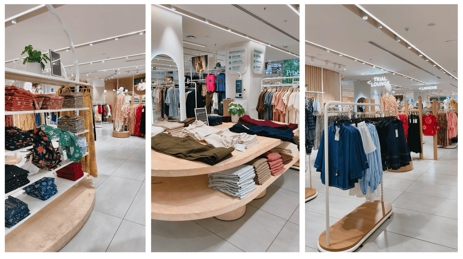
Tables and freestanding displays sit in open floor space, so they need to earn attention from multiple angles. A flat table covered in products at the same height is visually dull and easy to walk past. Here is how to fix that:
- Create height variation. Use risers, stacked books, wooden crates, or acrylic stands to build multiple levels within a single display. Varied levels make a display stand feel curated rather than simply stocked.
- Build around the rule of three. One hero product at the highest point, with two supporting or complementary items stepping down from it. As I said above, odd-numbered groupings are processed faster by the brain and tend to be more memorable than even arrangements.
- Use everyday objects as props. A stack of vintage hardcover books under a candle, a wooden crate beside a gardening product, a linen cloth draped over a raised surface. These details cost very little and add warmth that mass retailers struggle to replicate.
Shelving and Wall Displays
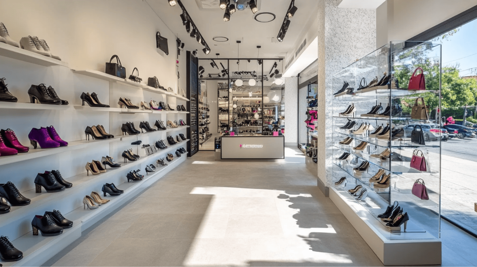
Shelves are where most retailers default to a purely functional mindset: fill the space, keep it tidy, and move on. But thoughtfully merchandised shelves do much more than hold stock.
- Break the shelf into mini vignettes. Group a small collection of items together every 4 to 6 feet to suggest how they might be used. A candle beside a small ceramic dish and a folded linen napkin creates a lifestyle moment that a standalone candle on a shelf simply does not.
- Use your vertical wall space. Floating shelves, pegboards, and ladder-style display stands draw the eye upward and make your store feel larger without taking up any floor area.
- Vary textures and materials. Mixing wood, metal, fabric, and glass within a shelf display creates visual interest that keeps customers looking longer. A shelf of identical product packaging with no variation in texture or height loses attention quickly. Contrast is what makes people stop.
Endcap Displays
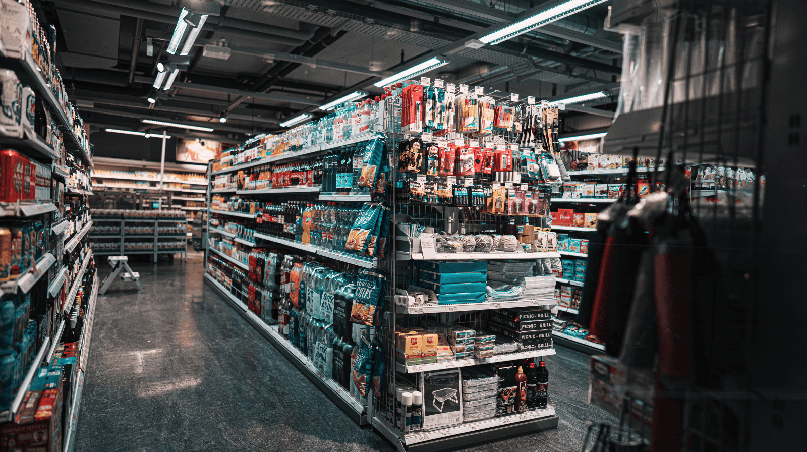
Endcaps are among the highest-performing display locations in any store, which is why what product you put on them matters more than most retailers realise.
- Follow the three-item formula. One hero product, one complementary item, and a small impulse add-on. The hero grabs attention, the complement increases basket size, and the add-on is an easy yes for a buyer already reaching for the first two.
- Rotate every four to six weeks. Regular customers notice when nothing changes, and a static endcap quickly becomes an invisible background to anyone who visits your store more than once a month.
Counter and POS Displays
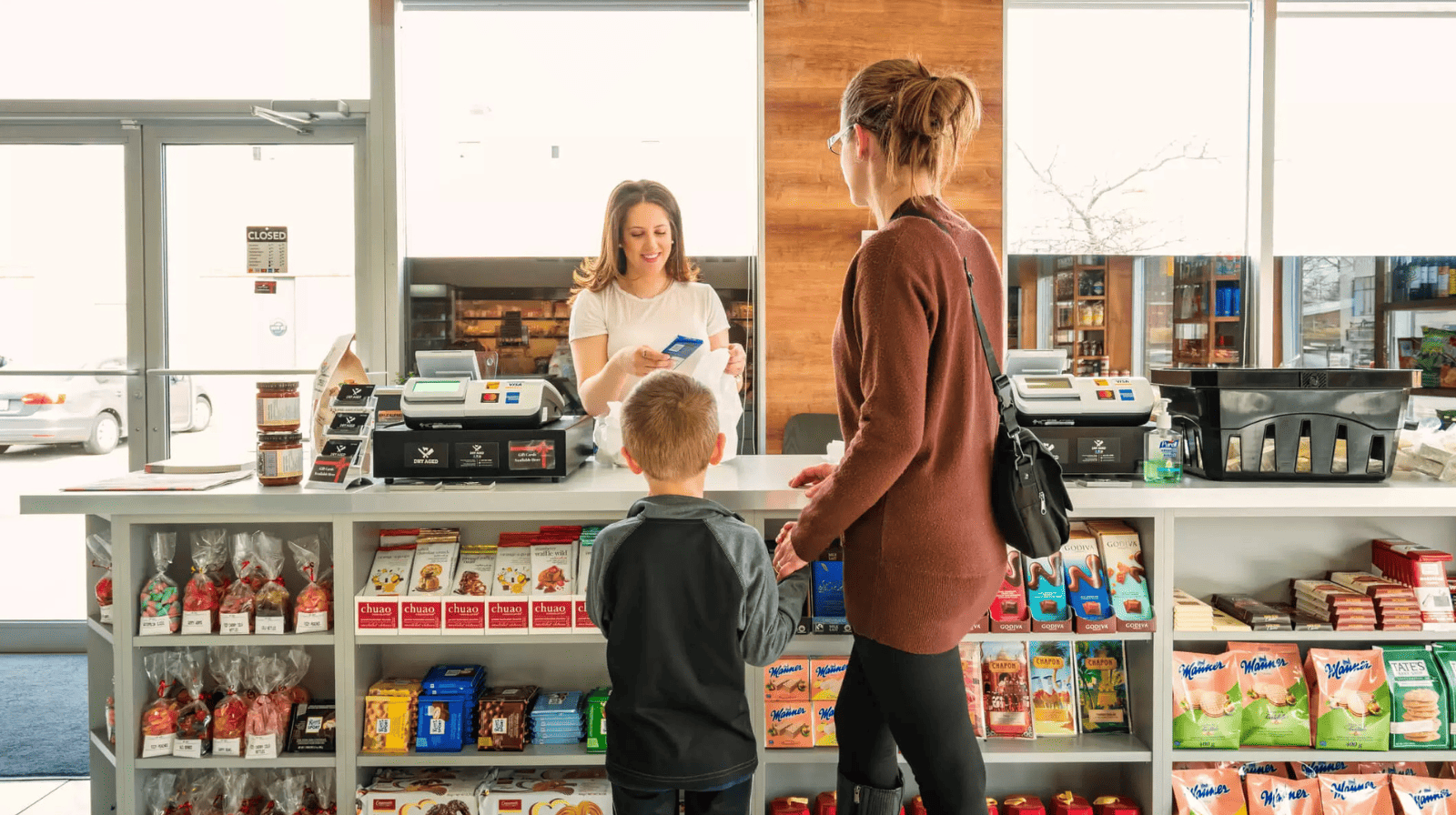
The checkout counter is the last merchandising opportunity in your store and one of the most misused by retailers. The core issue is confusion between two types of display: POP and POS.
POP (Point of Purchase) refers to any display in the store where customers are still deciding whether to buy, while POS (Point of Sale) refers specifically to the checkout counter, where the decision has already been made. Placing complex or high-ticket products at the counter puts the wrong thing in front of a customer who is mentally done browsing.
What actually works at the checkout counter:
- Items under £10–15 (or whatever represents a low-friction impulse spend in your context).
- Products that communicate their purpose at a glance.
- Things that pair naturally with what customers already have in hand (a candle next to a lighter, a bookmark next to books, a small tin of hand cream at a clothing checkout).
- Seasonal or limited items that create a sense of urgency.
Interactive and Sensory Displays
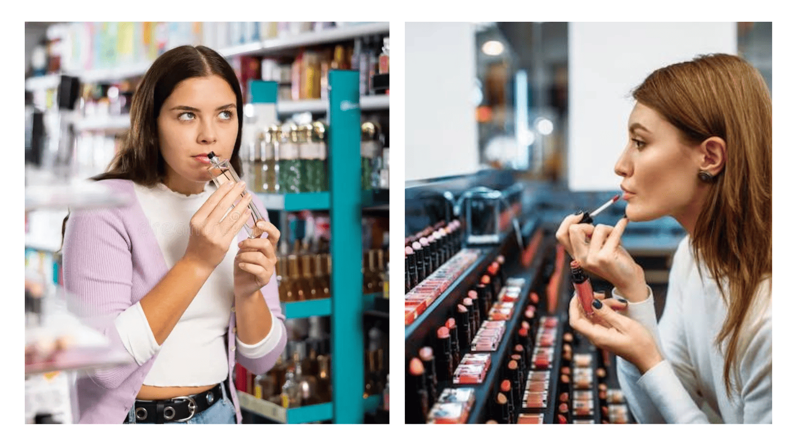
This product display idea is one of the most powerful tools available to independent retailers, precisely because large chains struggle to do it authentically.
Shoppers are 40% more likely to buy a product if they can try it before purchase, because touch creates a sense of ownership before the sale.
Your goal here is to remove barriers wherever possible. Instead of keeping products out of reach, you should encourage shoppers to engage with them. For example:
- Leave candles open so buyers can smell the fragrance.
- Display textiles where customers can feel the fabric.
- Provide cosmetic mini testers so people can try lipsticks, perfumes, and sunscreen before buying.
- Offer food samples when regulations and product types allow.
While locked cabinets can help protect high-value merchandise, they also add an extra step to the buying process. For products that benefit from hands-on evaluation, making them accessible often leads to better results.
You can also create a more engaging shopping environment through sensory elements. Soft background music can encourage customers to spend more time browsing, while a subtle scent that complements your product range can make the store more memorable.
Even a small demonstration or testing area can have a bigger impact than a shelf full of products that customers can't interact with. This is especially true for categories such as skincare, stationery, food, and accessories, where shoppers often want to see, feel, smell, or test an item before committing to a purchase.
Thematic and Seasonal Displays
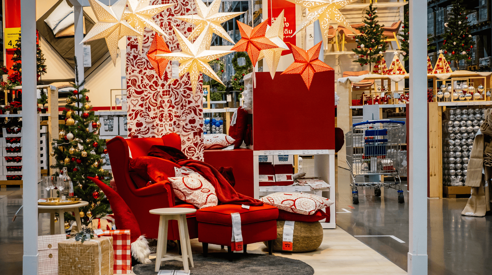
A seasonal display is not just a Christmas tree in the corner. It is a complete story built around a moment in time, and for returning customers, it is the clearest signal that something in your store has changed.
A few simple principles can help make seasonal displays more effective:
- Focus on a specific theme rather than a broad season. For example, "An Afternoon in the Garden" creates a clearer visual story than simply "Summer."
- Use props that help bring the theme to life and complement your products.
- Choose one product or collection to serve as the focal point.
- Keep the display stand confined to a dedicated area to achieve a stronger visual impact.
Now, many sellers update displays around major occasions such as Christmas, Valentine's Day, or Easter, but there are plenty of other opportunities throughout the year. Back-to-school shopping, Mother’s Day, Father’s Day, local events, seasonal lifestyle trends, and community celebrations can all inspire timely displays that feel relevant to customers.
Independent retailers can also draw inspiration from their own experiences, suppliers, or product sourcing journeys. Sharing the story behind a collection can make a display feel more personal and memorable while helping products stand out from those offered by larger retailers.
For the best results, plan seasonal displays ahead of peak shopping periods. Launching a display a few weeks before demand reaches its highest point gives customers time to discover products and make purchasing decisions before the rush begins.
Minimalist Displays
Stacking more products into a display stand does not translate to more sales. Research shows that minimalist displays with fewer products can increase a customer's perceived value of those products by 28%, which is something luxury retailers have built their entire visual strategy around for decades.
The reason is simple: the fewer things competing for attention around a product, the more important that product looks.
- A single candle on a plinth reads as something worth stopping for.
- Three candles arranged on a marble slab read as a curated set someone has thought carefully about.
- Fifteen candles crammed onto a shelf read as inventory waiting to be sold, nothing more.
You do not need to stock less or hide your range to use this. Keep your shelf fully stocked for customers who want options, but pull one strong item forward onto a small plinth or stand placed just in front of it. The shelf shows variety, while the plinth tells customers which one actually deserves their attention.
This is exactly why independent bookshops face certain titles outward instead of leaving every book spine-out on the shelf. A book displayed face-out next to dozens of spine-out titles around it consistently outsells the ones buried in the row, even when nothing about the book itself has changed.
Conclusion
The difference between a store that feels magnetic and one that feels forgettable is rarely about the products. It is about how you show these products.
Every product display idea covered in this guide costs little to implement but pays off every time a customer slows down, picks something up, and adds it to their basket. Start with one zone, one display, one change this week. The results will tell you exactly what to do next.
Product Display Ideas FAQs
How to design a product display?
Start with one hero product, build height variation around it using risers or props, and group items in odd numbers like three or five. Place it in a zone where customers are actually paying attention, not right at your entrance.
How do I attract customers with my display?
Build a clear story around one theme instead of showing everything you have and use lighting, scent, or sound to draw people in. A focused product display with a strong focal point pulls people in far more than a crowded one.
What is the decompression zone?
It is the first 5 to 15 feet inside your entrance, where customers are still adjusting and not really shopping yet. Save your best products for just past this point.
Where should I place my best-selling products?
Just past the decompression zone, to the right of your entrance, since most shoppers naturally turn right and engage there first. This is also where mid-store, eye-level placement matters most.
What is the right height to display products?
Around 14.7 inches below eye level, based on eye-tracking research, since this is where shoppers are most likely to buy. Products placed even one shelf below this spot can see sales drop by up to 25%.
How often should I change my store displays?
Refresh major displays every four to six weeks, and make smaller tweaks weekly. Customers stop noticing a display after two or three visits if nothing changes.
What should I put near the checkout counter?
Small, low-cost items that need no explanation and naturally pair with what is already in the customer's hands. Avoid anything expensive or complicated, since customers at the counter are done deciding.